


Pop Art
- Feb 20, 2017
- 1 min read
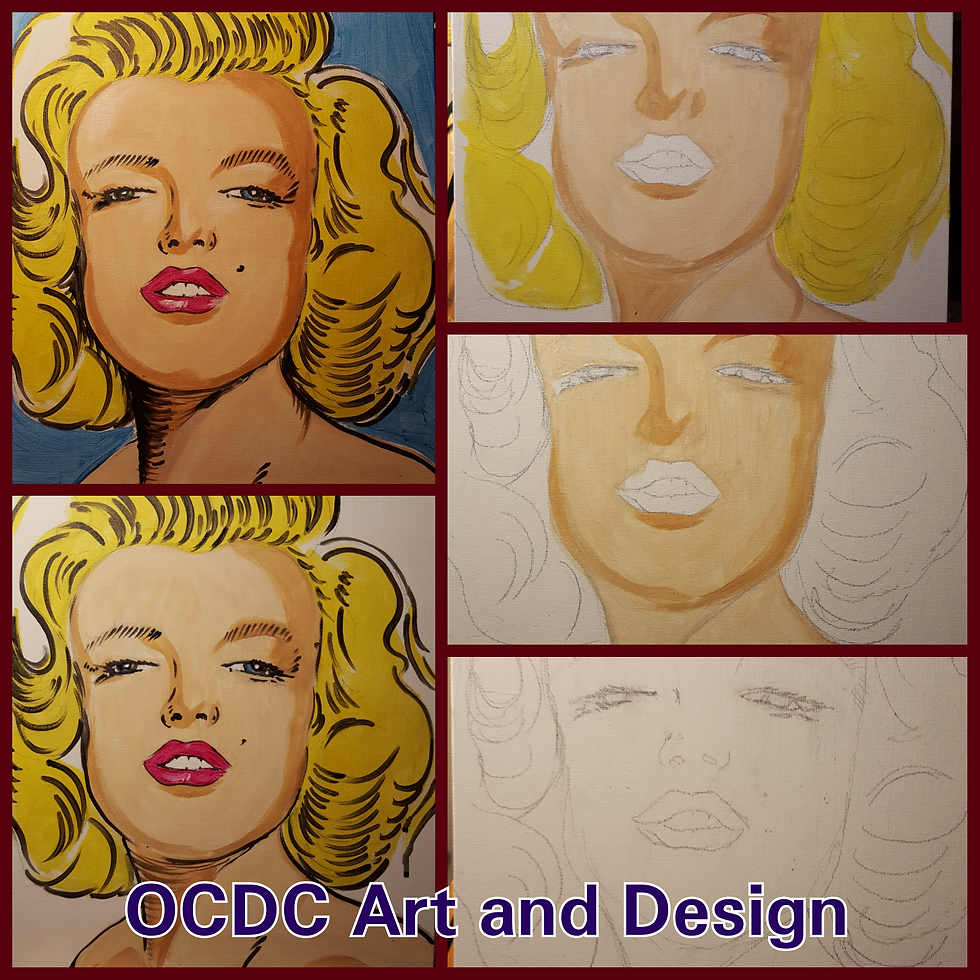
Pop art portraits
Brief Introduction to Color • Primary Colors: Red, Yellow, and Blue • Only colors that cannot be mixed from other colors. • Can get wide assortment of colors by merging these 3 colors.
Secondary Colors • Colors created by mixing two primary colors. • The 3 secondary colors are green, orange, and purple.
Tertiary Colors • Tertiary colors: made by mixing primary and secondary colors. 6 Tertiary colors include: yellow-orange, red-orange, red-violet, blue-violet, blue-green and yellow-green.
Warm and Cool Colors • Warm colors appear more stimulating and energetic. • Cool colors appear more relaxing and calming. • Where do you see warm or cool colors in society? • Why do you think Fast Food businesses tend to advertise with more warm colors?
Analogous Color Scheme • Colors that are right next to each other on the color wheel. • Example: yellow-range, orange, and red-orange • This pleasant scheme is often seen in nature and can be striking to the eye.
What makes this an analogous color scheme? What is the artist achieving with this color pallet?
Part 2: Intro to Pop Art? • An artistic movement of the 1950’s and 60’s in Britain and the United States. • Andy Warhol is considered one of the founders of this style. • Art that employs aspects of popular/mass culture such as famous people, advertisements, comic books, or even common objects such as Campbell's soup. • Popular things from the media and consumer culture.
Comments